
 (12 votes, average: 4.58 out of 5)
 Loading...
With the latest Google announcement, you cannot possibly push back the priority on having a mobile friendly website any longer. Unlike its earlier updates, Google’s recent update in search algorithm has been declared well in advance. To keep up with the recent influx in mobile search, it is but obvious that search engine algorithms are at par with the demands and usage pattern of its users. Therefore from April 21st, mobile compatibility would serve as a major ranking signal for any website on Google. And this change for sure will adversely affect the websites which are yet to be optimized for mobile view. Since we are aware of the importance of search visibility and SEO of a website, let’s take a look how this update will concern you and what you can do about it:
As per the recent Google statistics, 50 percent of the internet searches originate from mobile devices. In fact, mobile search has beaten desktop-based digital media. Now this is significant! The figure further indicates that a mobile-friendly webpage is a necessity, not an extravagance anymore. The anticipated algorithm update from Google will impact the mobile search results. With this announcement, Google will supposedly reward mobile-friendly websites with improved search rankings. Conversely, if it’s not optimized for traffic coming from mobile devices, one can pretty much expect its negative impact on one’s mobile search rankings. This is because non-mobile-friendly websites will have to count only on desktop-based organic traffic. Have you ever tried to access a non-responsive website from any of your handheld devices? By all odds you might have left the site right away as it’s too painstaking to view the page properly. So basically, at this juncture you are left with two options: Responsive Web Design or Mobile version of your desktop site.
If you are a bit confused between responsive design and dedicated mobile site, here’s what you need to know – a dedicated mobile site is especially optimized for mobile searches. It’s cost-effective with limited content, distinct navigation system and other discrete mobile-only options. But its optimal display on intermediate resolutions with diverse screen widths poses a serious threat. Contrariwise, a responsive site is well-adept to handle any resolution, be it a laptop, PC, smartphone or a tablet. Therefore if you go responsive, you need to have only one website to maintain. So which is better? Here are the pros and cons of responsive design versus mobile website:
Pros of Responsive Web Design:
- It’s super flexible and fluid.
- Provides you with awesome user experience.
- It’s profitable as it goes with any device as compared of having two separate websites to build and maintain.
- Google recommended.
- Easy Marketing.
Cons of Responsive Web design:
- As it’s relatively a new technology, you might face some loading issues in old devices with outdated browser.
- Expensive to build compared to an ordinary desktop site (although completely worth it, if you consider its ROI)
Pros of Mobile Sites:
- Loads faster
- In comparison to responsive, a mobile website is a cheaper option (unless you include the cost of its desktop version into consideration).
- For local search, mobile sites have greater chances to rank high.
Cons of Mobile Sites:
- Maintenance can be an issue as you have to maintain two sites simultaneously.
- Compatibility issue with touch screen and keyboard navigation.
As it clearly shows, both have their own pros and cons, and they are not clearly indicative of any particular winner. Having said that, a responsive website redesign is a more popular option to most webmasters out of the two, simply to do away with two versions of the same webpage – the ‘m’ version and the ‘www’ version. However, if you are still unsure whether to go for a responsive redesign/ mobile friendly design makeover or to commission a mobile version of your website, you could probably find out one critical aspect – what kind of website do you have? Technically, if it is a large and complex site with layers of mature custom legacy codebase, then you may opt for a simpler mobile version that can lead mobile visitors to a more compact and targeted version of site showing the most important information and features, leaving out anything fancy. Again, from the operations perspective (and this is generally true for bigger websites and an even bigger company), if that complex website involves a lengthy process of approvals for every single amendment from several levels up, it would perhaps be a good idea to build a mobile version without impacting an already popular and busy website.
This recent algorithm is yet to be released but app indexing for better ranking has already been announced on February 26th this year. Google’s move on app indexing is rightly anticipated as 26% of the mobile searches originate on recognized apps and almost 88% of the mobile users, irrespective of age, use mobile apps. This goes out specifically for signed-in users with Android apps. However, it’s assumed that Google is considering iOS devices for app indexing as well.

Do you get a ‘mobile-friendly’ tag on mobile search?
Check out if your website is mobile friendly. Use Google provided testing tools to ascertain if your site is compatible with mobile view. If it is, you will see your website has a ‘mobile-friendly’ tag next to its link on mobile search result (as shown on the image above). This impending algo change can work in favor of businesses that have already responded to the growing need for mobile ready websites and those that are willing to quickly tune in. The others run the risk of being left behind by their competitors.
Why is Google bringing this new change in its algorithm in 2015? Clearly, it just wants to provide a more inclusive search result to its users, both in terms of content and user experience. And this comes as a natural progress from the earlier Hummingbird update that addressed voice search, especially considering the boom in mobile devices and a user’s convenience to speak to its device on the move rather than typing in keywords on the go. Quite naturally, the proposed attempt is another push at responsive web design and mobile friendly websites. There are just a few things that a webmaster needs to address prior to rushing for a website update. What percentage of your website traffic is going to get affected by this update? What kind of content do you hold on your website? Would a uniform responsive website serve better for your users in term of their experience in interacting with you, or would a (minified) mobile version of it be more appropriate? Take time out to sort these issues and seek responses before you take a step. (Tools like Google Analytics gives you an exact percentage of traffic derived from desktops, mobile devices and tablet to your site). Like most websites today, if you see a considerable traffic from mobile devices (anything above 20% should be good), this update can create a major influence on your online business, and it is indication that you should act immediately. With this update and its subsequent deluge of responsive and mobile sites on the web, the figure (of incoming mobile traffic) will only increase.
Take this update as a wake-up call to embrace the future. Mobile it is, and that’s the way to go. It is never too late if you haven’t considered Google’s previous recommendations on mobile friendly sites too seriously. If you want to stay in the business (and it does not matter if you sell online, you always indirectly sell your Brand to your potential visitors), there is absolutely no way that you can ignore this call.
Related Posts
 Does Branding affect Google ranking?
 TiECon Kolkata 2015, Fostering Entrepreneurship Globally, yet again!
 White Label Website Design and Development Services
 How effective is Google Authorship?
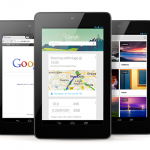 Google launches new Tablet for $199
 How to pull up your website’s conversion rate?
 How has google changed after Hummingbird?
 Web Design and Development Company